Write Small UIs Effectively
Learn to Write Concise HTML/CSS by Following Good Coding Practices
HTML/CSS Challenges
Follow a set of instructions to shape user interfaces gradually.
-
HTML Scenario
Write the HTML code following the nesting instructions
-
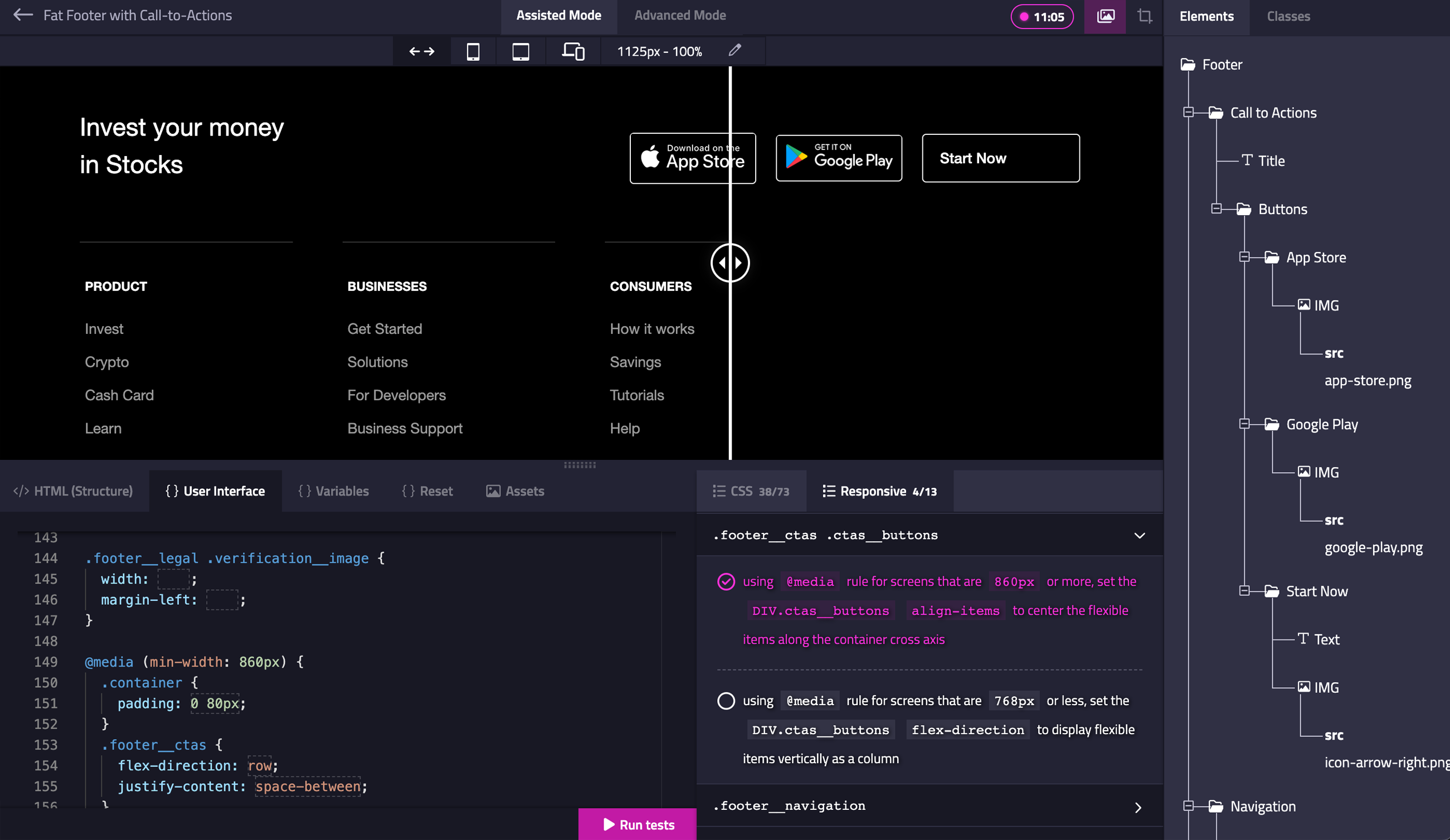
CSS Scenario
Read the CSS instruction and fill the blank (CSS property value)

VR Headsets
head-mounted display
                            <a href="#" class="card">
  <img src="vr-headset.jpg" class="card__picture" alt="Girl Wearing VR Headset" />
  <div class="card__content">
    <h3 class="card__title">VR Headsets</h3>
    <span class="card__category">head-mounted display</span>
  </div>
</a>

                            .card {
  position: relative;
  overflow: hidden;
  display: flex;

  width: 400px;
  border-radius: 10px;
}

.card::before {
  content: "";
  position: absolute;
  left: 0;
  width: 100%;
  height: 100%;

  transform: translateY(101%);
  transform-origin: bottom;

  opacity: 0;
  transition: transform 0.4s cubic-bezier(0.25, 0.46, 0.45, 0.94);
}

/* -------- Content ------- */
.card__content {
  position: absolute;
  bottom: 12%;
  left: 8%;
}

.card__content::before {
  content: "";
  position: absolute;
  top: -10px;
  left: 0;
  width: 0;
  height: 2px;

  background-color: var(--white);
  transform: translateY(40px);
  transform-origin: left;

  opacity: 0;
  transition: transform 0.5s linear, opacity 0.5s linear, width 0.5s linear;
}

.card__content .card__title {
  color: var(--white);

  font-size: var(--fontSizeLarge);
  transform: translateY(100px);
  opacity: 0;
  transition: transform 0.5s ease-out, opacity 0.5s linear;
}

.card__content .card__category {
  display: block;

  margin-top: 5px;
  color: var(--white);
  font-size: var(--fontSizeRoot);
  transform: translateY(150px);

  opacity: 0;
  transition: transform 0.5s ease-out 0.1s, opacity 0.5s linear 0.1s;
}

.card__content .card__picture {
  border-radius: 10px;
}

/* --------- Hover -------- */
.card:hover::before {
  background-color: var(--primary);
  transform: none;
  opacity: 0.7;
}

.card:hover .card__content::before {
  width: 40px;
  transform: none;
  opacity: 1;
}

.card:hover .card__title,
.card:hover .card__category {
  transform: none;
  opacity: 1;
}
Compare & Inspect
Inspect and Compare your result with the preview.
Responsive Controls
Adapt user interfaces to multiple resolutions.
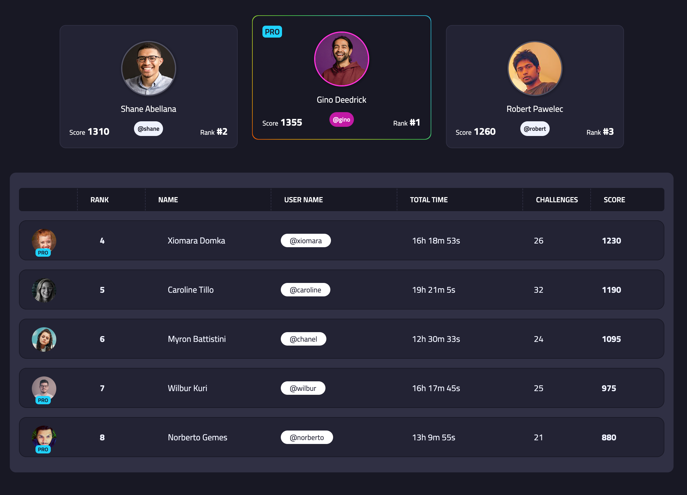
Leaderboard
Challenge yourself in writing semantic code.
Challenge yourself.
Compete with others.
Put your HTML/CSS skills to the test and compete against others around the world while you learn! Challenge yourself by completing each challenge. Try to be the top in time and make it faster than others.
Leaderboard